7 min read
Text resize and WCAG: where fluid typography breaks accessibility
How WCAG 1.4.4, 1.4.10, and 1.4.12 apply to fluid type built with CSS clamp — and why a vw-only clamp() token fails users who resize text instead of zooming.
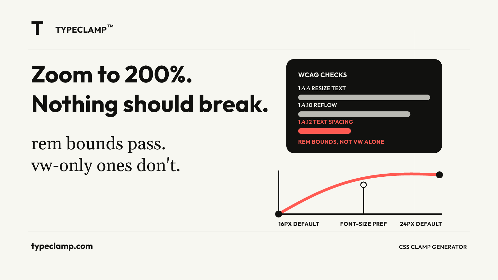
What "resize text" actually means
WCAG 2.1’s Success Criterion 1.4.4 (Resize Text, Level AA) requires that text can be resized up to 200% without loss of content or functionality, without needing assistive technology. Most teams read that sentence, test it by hitting Ctrl/Cmd-+ a couple of times, see the whole page scale up cleanly, and move on. For a fluid type system that check usually passes, and it’s testing the easy case.
Browser zoom is a uniform magnification: the CSS layout viewport stays the same logical width, but every pixel — text, images, vw-based headings, rem-based body copy — is rendered larger together. A clamp() value that looks great at 100% still looks proportionally right at 200%, because nothing about the relationship between elements changed. This is why fluid type and zoom coexist peacefully almost all of the time, and why 1.4.4 rarely surfaces bugs during a normal design review.
The failure mode that actually matters for fluid typography is different, and it doesn’t show up under Ctrl-+. It shows up when a user changes their browser’s default font size — the "Font size" setting in Chrome or Firefox preferences, or Dynamic Type on iOS — instead of zooming the whole page. That setting changes the root font-size, not the viewport. A clamp() expression that was built entirely out of vw never notices.
Why a vw-only clamp() is not accessible
Every previous article in this series has quietly used rem for the minimum and maximum bounds of a clamp() token — how to convert Figma font sizes to CSS clamp tokens generates clamp(2.5rem, 1.544rem + 4.082vw, 5.25rem), never a version with px or bare numbers. That choice is not stylistic. rem is computed relative to the root element’s font-size, which is exactly the value a user’s font-size preference changes. vw is computed relative to viewport width, which a font-size preference never touches.
Set the browser’s default font size from 16px to 24px (a real setting real low-vision users use) and .heading-bad does not move a pixel — it is deaf to the one control most directly built for this purpose. .heading-good does better: both the 2.5rem floor and the 5.25rem ceiling scale up by the same 1.5× the root font-size scaled, widening the whole usable range. The vw term in the middle stays tied to viewport width and doesn’t get that boost, so the fluid slope underneath the plateau is less responsive than the endpoints — but the endpoints are exactly where accessibility complaints happen, because they’re what a text-heavy page mostly renders at once it’s zoomed enough to matter. A clamp() with rem bounds and a vw-driven middle is a reasonable, defensible compromise. A clamp(), or worse a bare font-size: Xvw, with no rem anywhere is not.
/* Ignores the user's font-size preference entirely */
.heading-bad {
  font-size: 5vw;
}

/* Bounds respond to font-size preference; the middle term partially does */
.heading-good {
  font-size: clamp(2.5rem, 1.544rem + 4.082vw, 5.25rem);
}
Two more criteria that fluid type interacts with
1.4.4 gets cited the most, but two adjacent WCAG criteria break more often in practice on a fluid type system, and both are easy to check once you know to look.
1.4.10 Reflow requires content to be usable without horizontal scrolling at a width equivalent to 320 CSS pixels — the state a 1280px-wide layout reaches at 400% zoom. This is really the same requirement the mobile viewport anchor already protects against for design reasons: if your fluid scale’s minimum was chosen against a real 375px frame and tested there, it’s very likely already reflow-safe, because the same failure — text or containers that don’t shrink gracefully — shows up at both. The tokens that skip a deliberate mobile anchor and just extrapolate the formula downward are the ones that clip a word or force a horizontal scrollbar at 400% zoom, because nobody actually looked at that width.
1.4.12 Text Spacing requires the page to stay usable when a user overrides line-height, paragraph spacing, letter spacing, and word spacing via a stylesheet or extension — the standard test applies line-height: 1.5, letter-spacing: 0.12em, word-spacing: 0.16em, and 2em margins below paragraphs, then checks nothing clips or overlaps. Why line-height is harder on the web than it looks already argued for unitless line-height on the grounds that it scales predictably with font-size; the accessibility upside is the same mechanism working in your favor a second time. A component with line-height: 24px hard-coded on 16px text fails the override outright — the box can’t grow, so the enforced 1.5 multiplier has nowhere to go and text overlaps. A component with line-height: 1.5 absorbs the override, because it was already expressing the relationship the criterion demands.
Testing a fluid scale the way a low-vision user would
The gap between "we checked it" and "it’s actually accessible" is almost always a gap in what got tested. A useful pass takes fifteen minutes and covers four checks that a visual design review normally skips entirely:
Browser zoom to 200%. Confirm nothing clips, no text sits under a fixed header, and no button becomes unreachable. This is the literal text of 1.4.4 and the one most teams already do.
Browser zoom to 400%, or resize the viewport to 320px wide. This is 1.4.10 Reflow. Watch for horizontal scrollbars and for headings that were fine at the design viewport but were never actually checked against your true minimum.
Change the browser’s default font size, not the zoom level — in Chrome, chrome://settings/fonts; in Firefox, about:preferences#general → Fonts. This is the check that catches a vw-only heading, because zoom testing alone will never catch it.
Apply a text-spacing override. A short bookmarklet or a browser extension like the "WCAG Text Spacing" tester injects the 1.4.12 rules; run it against your densest card or table component, where fixed heights are most likely to be hiding.
None of these are exotic tooling. They’re closer to "change two browser settings and look at the page," which is exactly why skipping them is so easy and so common. Put them in the same pass where you already check the design viewport and the mobile viewport from responsive typography with CSS clamp — it’s the same page, the same component, just two more browser settings flipped before you look at it again. Treating it as a separate accessibility audit that happens later, if at all, is exactly how a scale ships with a vw-only heading nobody noticed.
Choosing clamp() bounds that hold up
The practical rules fall out of the failure modes directly, and none of them require rebuilding a type system that already follows responsive typography with CSS clamp:
- Always express the minimum and maximum of a clamp() in rem, never px. This is a one-line rule and it’s the single highest-leverage fix on this list.
- Don’t cap the maximum out of pure caution. A low max value protects your layout from feeling oversized on a 1440px monitor, but it also caps how large text can get for a user who has already turned their font-size preference up — because the ceiling is a hard ceiling regardless of why the computed value wants to go higher. If a design genuinely needs a tight max, that’s a legitimate call; just make it deliberately, the way typography tokens for design systems argues every fluid bound should be documented and decided on purpose, not left as an unexamined default.
- Never ship user-scalable=no or maximum-scale=1 in the viewport meta tag. This disables pinch-zoom outright on mobile and is a direct, unambiguous 1.4.4 failure — no amount of well-built clamp() tokens compensates for a meta tag that turns zooming off.
- Test spacing with rem-based, unitless-line-height tokens the same way, since fluid spacing with CSS clamp tokens are exactly as capable of hard-coding a static px gap that breaks a text-spacing override as a font-size token is.
<!-- Fails 1.4.4 outright, regardless of how the type scale is built -->
<meta name="viewport" content="width=device-width, initial-scale=1, maximum-scale=1, user-scalable=no">

<!-- Correct: let the browser's native zoom do its job -->
<meta name="viewport" content="width=device-width, initial-scale=1">
A checklist that survives an audit
Fluid typography and accessibility are not in tension — a well-built clamp() scale, expressed in rem, with a deliberately chosen mobile floor and a maximum that was a decision rather than an accident, tends to pass 1.4.4, 1.4.10, and 1.4.12 more reliably than a set of fixed breakpoint sizes ever did, because the whole point of the scale is that it responds to the environment instead of assuming one. The failures in this article aren’t failures of fluid type as an idea; they’re failures of building it with vw alone, skipping the mobile anchor, or leaving line-height and spacing as fixed pixels next to a font-size that moves.
Before shipping a scale, run it once through the TYPECLAMP generator and check that every token’s minimum and maximum are rem, then run the four-check pass above against the real page, not just the component in isolation. It costs less time than the deploy it might otherwise block, and unlike most accessibility remediation it doesn’t arrive as a separate ticket months later — it’s a property of the token itself, checked once at the moment the scale is built, not re-litigated on every page that uses it.